You know the drill by now – 2020 has sucked phenomenally. But… it forced the majority of us to face our mortality in the eyes, and have a really intense staring contest… for over half a year. Anyway, ten years from now we’re going to look back on 2020 and face something else that might spark another existential crisis.
What the fuck did you do with your time?
Don’t get me wrong, if you prioritised your health; be it mental or physical, that is more than enough. But while most of us were scrolling through TikTok, getting in heated debates on Zoom whether or not Carole Baskin killed her husband… some actually took the extra time on their hands to start up a business! I know, entrepreneurs right?
That’s the case with Jennifer Shaw, who approached us with an idea to create a modern-day law firm, one that pushes the boundaries, a law firm that’s funky. Anything with the word “funky” in it and you’ve got our attention.
If you’re going to take on the journey of setting up a business, you’re going to want to establish a brand that will stand out among your competition. How do you do that? Well, the best way to identify the overall ‘look’ you’re going for is by, you guessed it; moodboards.
What are moodboards?
A moodboard is a collage of ideas. It gives a quick glimpse into the feelings that the brand portrays, the colours, the textures, the overall aesthetic of the brand. At Systemato, we use moodboards to help our clients (and ourselves) in making sure we are on the same page when it comes to designing their brand. So before we create the logo, choose the fonts, name the business, all that fun stuff, we create a moodboard.
Let’s bring Jen back into the picture. After a call and an interview asking her what she has in mind; we narrowed the 8 pages worth of feedback into 3 things:
- Funky law firm
- Millennial aesthetic
- Plants and natural hues
So off to the drawing on the moodboard we went (see what I did there?)! We decided to design three moodboards in order to make the decision making process slightly easier.
The first moodboard involved no plants, an inspiration that Jen brought up a few times. Why might you ask? Well, a wise man known as Steve Jobs once said: “People don’t know what they want until you show it to them”. Our words leaned closer to “to hell with it”, but we’ll go with what Steve said for the sake of being #professional.
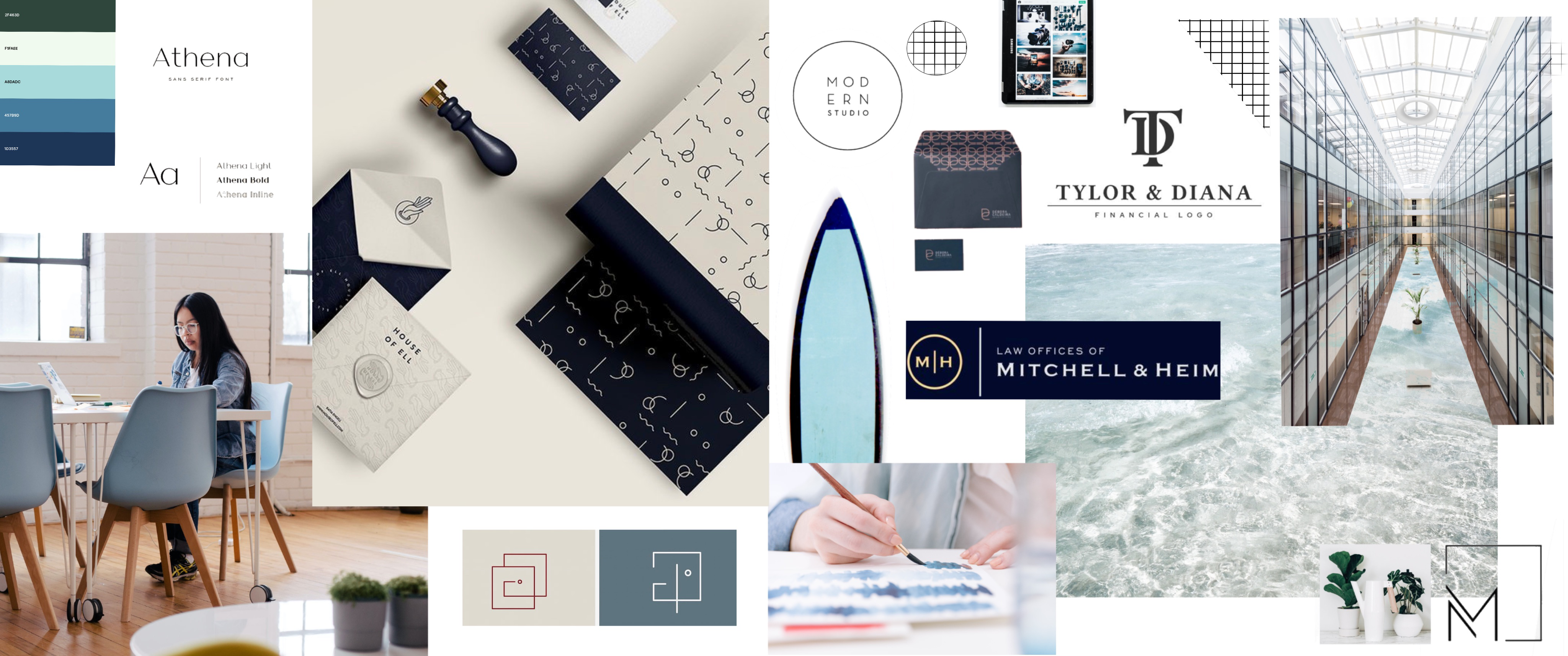
In this case, going to hell with it didn’t work in our favour; she didn’t like it. She was nice about it though “the blue colours remind me too much of the traditional law firms so would like to avoid this colour palette”, so thank you Jen, for not hurting our feelings.
For the next moodboard we tried to go for a more minimalist-chic vibe . We took up her comment on using plants and natural hues, and let soft pastels (mostly coral) to guide us in drawing inspiration for this moodboard.
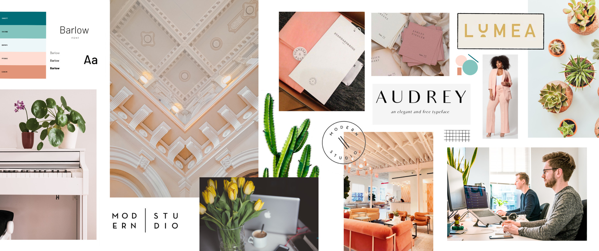
“I like it, but it’s too feminine”. Fair play Jen, I guess the hipster lad with the Funko Pop on his desk didn’t exude enough testosterone to out do the velvet coral couches. Which is fine, I guess.
We’ll save you the torture from having to look through our Google Drive folder containing endless photos of house plants by showing you the winning mood board.
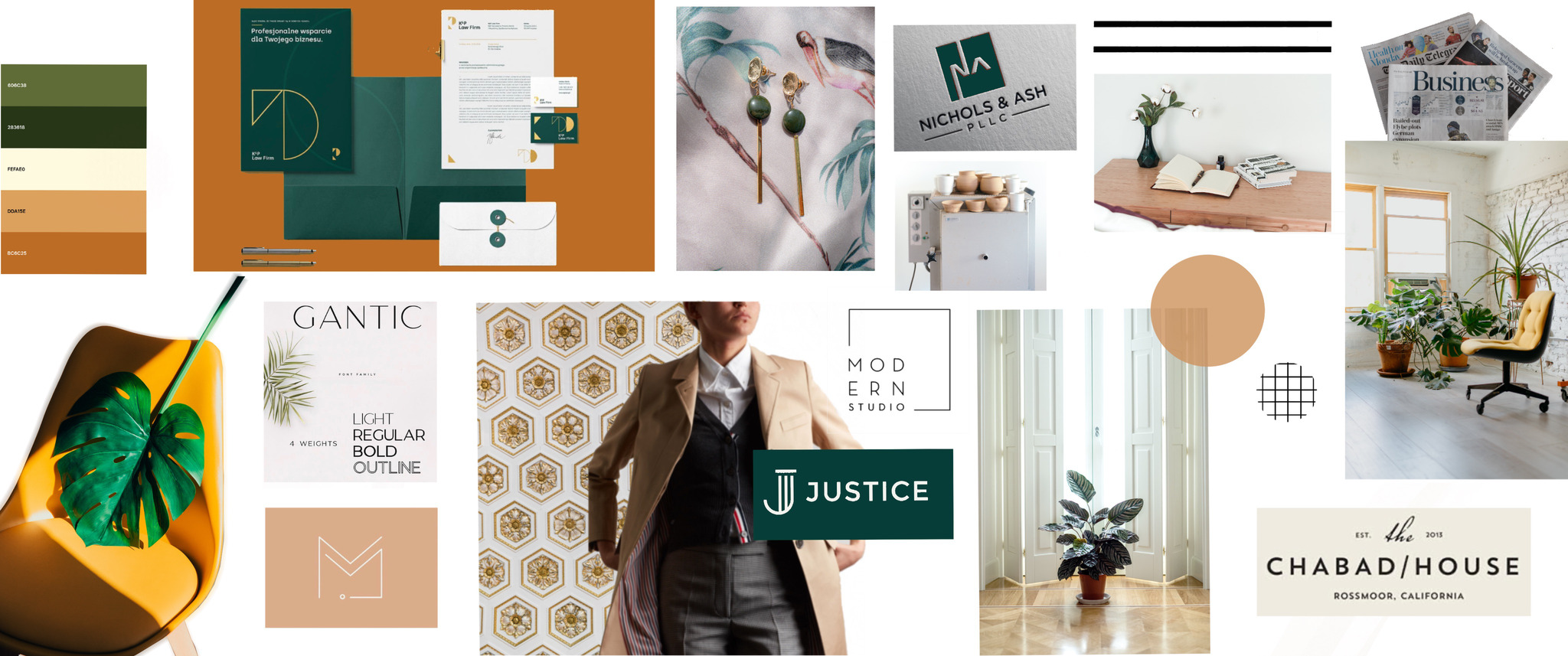
“Colours and aesthetics are spot on” I know, nothing that a Swiss Cheese Plant can’t do.
So we got the mood board settled, we’re opting for dark greens and light browns. Now what? Well, now we know where we’re going with Jen’s brand. This mood board will help in drawing inspiration for designing the logo, the website and basically all the visuals that will be used to communicate to clients from now on. In simpler terms, if we get stuck on what visuals to use, we will just use the mood board for guidance.
As the days progressed after the above moodboard was chosen, Jen came back to us saying that she actually envisions her brand containing elements of all three moodboards rather than just one.
This is why we use moodboards in the first place, entrepreneurs tend to beat themselves up over their decisions, but the ability to admit that you have changed your mind is only a step in the right direction to create a successful business. Therefore the final branding product and digital strategy for Shaw Legal is a mix of navy (first moodboard), coral (second moodboard) and neutrals (third moodboard).
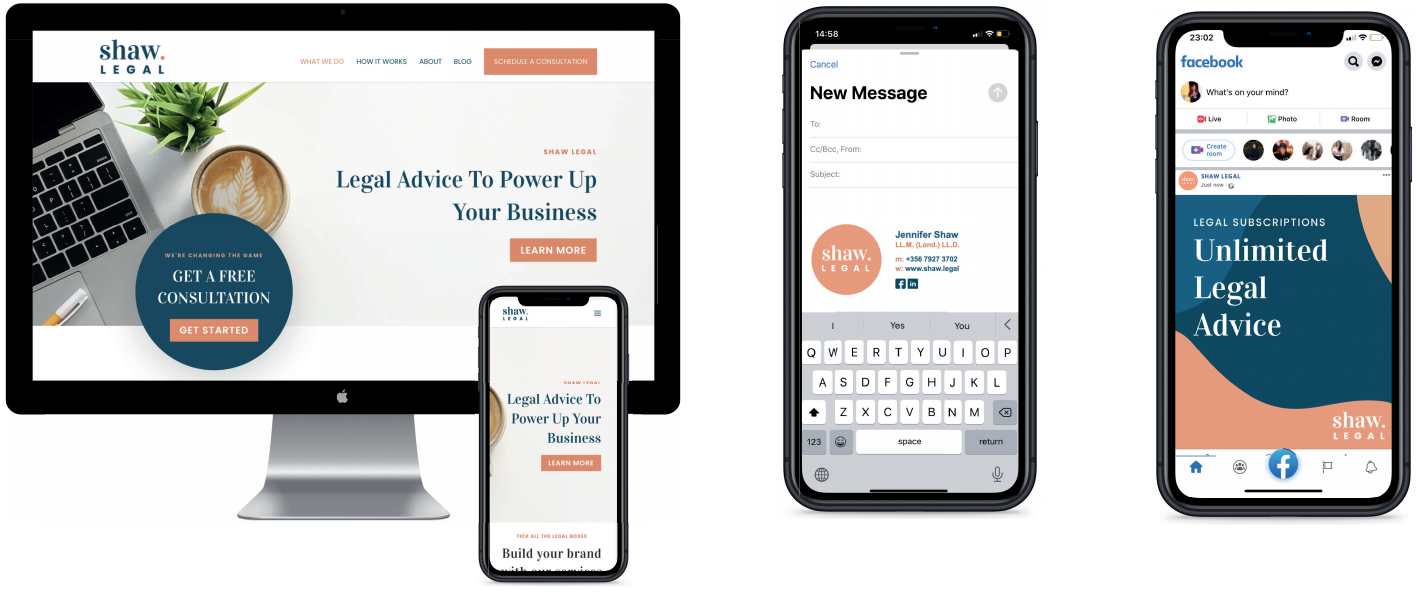
With the right design, any brand can effortlessly stay on point to cultivate the right kind of emotional response from its followers and clients. If like Jen, you also have a COVID-created business brewing in the works, feel free to schedule a call with us.
